

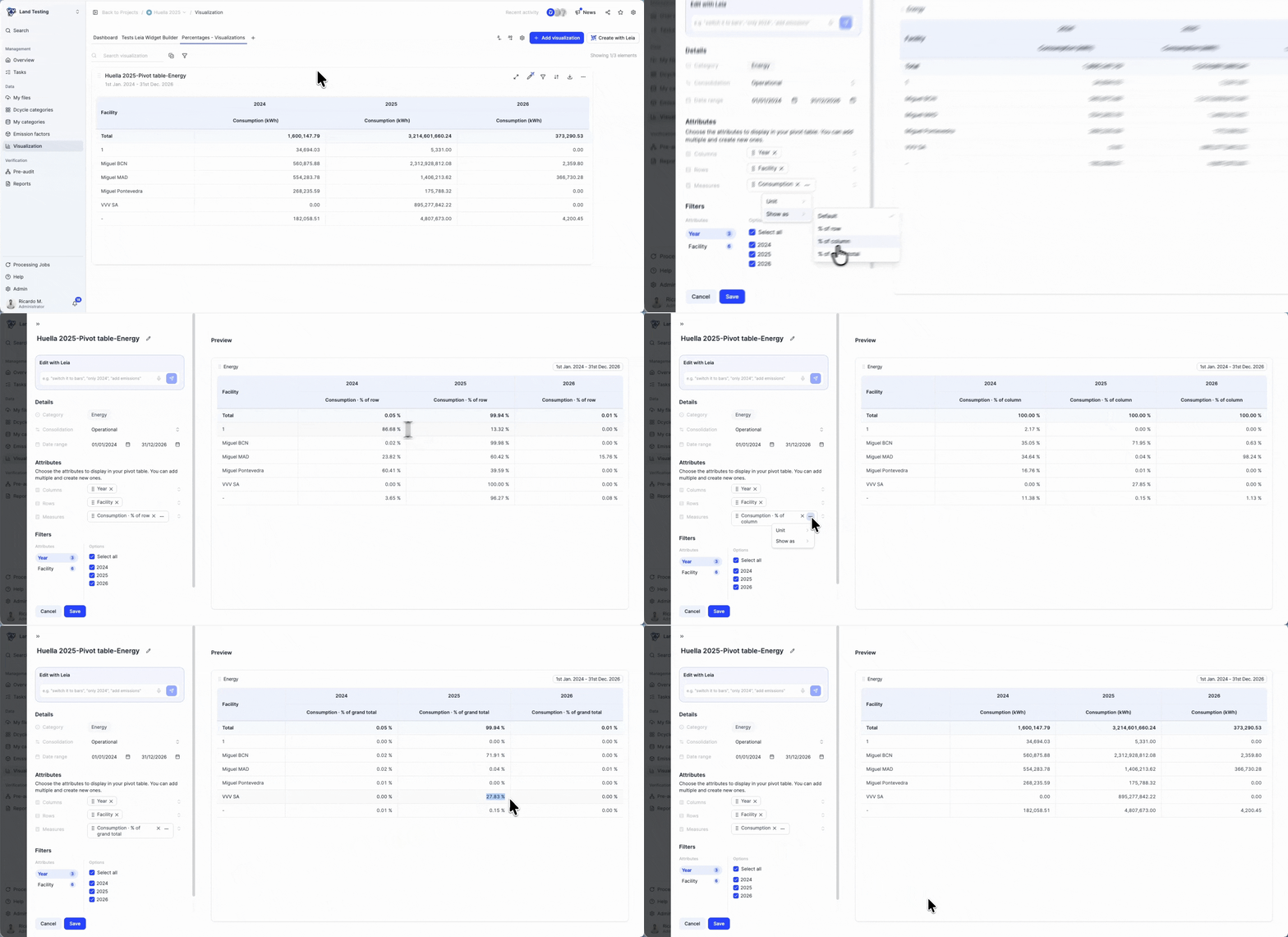

You can now display any metric as a percentage, of row, of column, or of the grand total, right inside your pivot tables and dataset visualizations, without exporting to Excel.
What changed?
- A new “Show as” option on every metric: Default, % of row, % of column, % of grand total (in tables), and % of total (in charts).
- It’s set per metric, show one metric as a percentage while others stay in absolute values, side by side in the same view.
- Percentages are exact: each row, column, or the whole table adds up to 100, and they respect organization-structure consolidation and your filters.
- Available in both the pivot tables and the dataset visualizations used in the custom-categories flow.
How to use it
When building a visualization, open a metric’s ⋮ menu and pick “Show as”. It’s already available to everyone, no setup needed.